Swatch x AP: Why a Vibrant Pocket Watch?

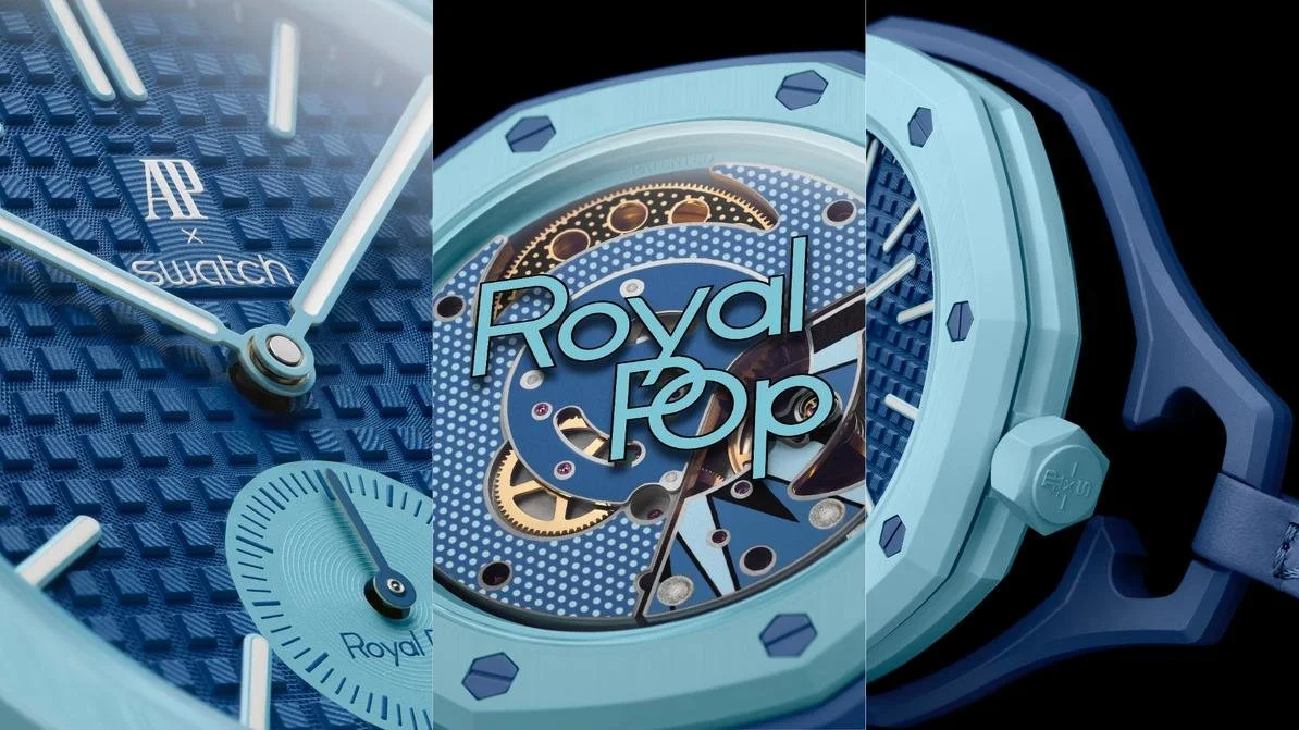
The "biscuit box" mystery in the Swatch window has finally been unveiled. Since the first clue dropped during Watches and Wonders a month ago, various speculations about its form have finally settled. The result is not the "Ceramic Royal Oak" many anticipated, but a pocket watch. So, why a pocket watch?
1. Isolating Core Assets
This collaboration differs fundamentally from previous ones with Omega or Blancpain. As an independent brand, AP’s commercial empire is heavily reliant on a single totem: the Royal Oak. Despite efforts like the Code 1159, the public’s perception of AP remains tethered exclusively to the "Oak."
A Bioceramic wrist version would subconsciously deconstruct the class attributes of the Royal Oak as the "Steel King," even at high premiums. By using the pocket watch as a medium, Swatch cleverly extracts AP’s DNA (such as the octagonal bezel and rivets) while drawing a clear physical line against AP’s core profit driver—the integrated bracelet sports watch. It harvests massive traffic while preserving the sanctity of the core asset.
2. Reaffirming the "Second Watch" Concept
The market has long forgotten Swatch’s original naming intent: "Second Watch."
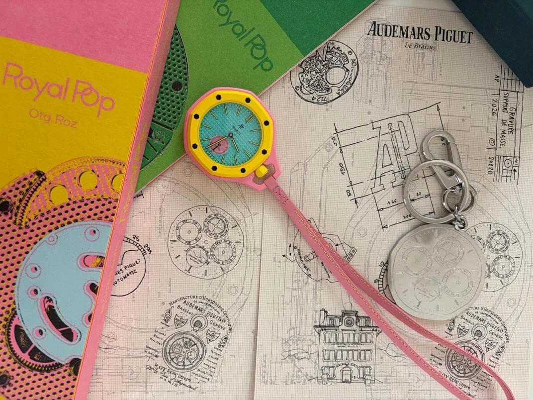
Most enthusiasts only have two wrists, already occupied by traditional giants or the Apple Watch. This time, Swatch isn't fighting for wrist real estate. As a "Second Watch," it is no longer bound by traditional wearing logic; it becomes a pendant, a bag charm, or a desktop art piece. Through this form, Swatch bypasses the brutal competition for the wrist and enters the "fashion accessory" incremental track. Furthermore, the modular frame design and the 3 o'clock crown placement leave ample room for third-party co-creation of straps and accessories.
3. Returning from the "Octagon" to "Grand Complications"
Public perception of AP is being oversimplified into just an "octagonal bezel." For a century-old family brand with deep traditions in complications, this is both a success and a curse.
Leveraging Swatch’s global influence, AP is conducting a low-cost cultural education. The pocket watch is the origin of AP’s "Grand Complication" gene. By applying a Pop Art aesthetic, the collaboration translates "high-brow" brand history into a trend symbol accessible to the youth, facilitating a mental shift from a "nouveau riche label" back to a "master watchmaker."
4. Pre-Fashion Week Ambush: A Surgical Strike Against Rolex and Cartier
Launching one month before Fashion Week is a masterstroke of marketing positioning.
The fashion world's "uniform" has long been dominated by the elegance of Cartier or the liquid-asset status of Rolex. The industrially-driven Swatch Group urgently needs to enter the core fashion discourse. This collaborative pocket watch acts as "social currency"—more disruptive than Cartier and more avant-garde than Rolex. It isn’t just selling a watch; it is planting a new visual anchor for the street-style cameras of Fashion Week.
When the MoonSwatch was first revealed, many feared it would tarnish Omega's image—similar to the initial fear that smartwatches would destroy the Swiss industry. Instead, MoonSwatch buyers learned the history of the Moon landing, and many became actual Moonwatch customers.
From Omega to Blancpain, collaborations have covered chronographs and divers. The market now demands a stronger stimulant. As "Quiet Luxury" displaces street style, the era of massive queues has faded. Given the Swatch Group’s nature of "disliking capital maneuvers while being intensely profit-driven," shortages are not a marketing ploy but a production reality. In a year or so, this piece will be as accessible as the MoonSwatch is today.
No more queues—that is the final stance.
Photo credit: La Figaro / Swatch/Audemars Piguet